The Packers Look: Logos, Uniforms and Helmets

By Ed Wood

The Green Bay Packers are one of the most unique teams in today’s sports landscape. They’re a sporting dinosaur in the middle of the big city. Indeed, the Green Bay Packers franchise is run by a non-profit corporation and owned by the citizens of the city. It has made a lasting impression on many NFL football fans thanks to its outstanding performances on the field. What do you need to know about the Green Bay Packers’ visual identity, uniforms and helmet?
Green Bay Packers visual identity
The Green Bay Packers have used several different logos since the franchise’s inception before adopting the iconic “G” you now see on the helmet. The franchise owns the trademark for this logo, but it grants limited permission to other organizations (University of Georgia and Grambling State University) wishing to use this distinctive emblem. To find out more about entertainment games, you can try your hand at the dice offered by the online sports betting site.
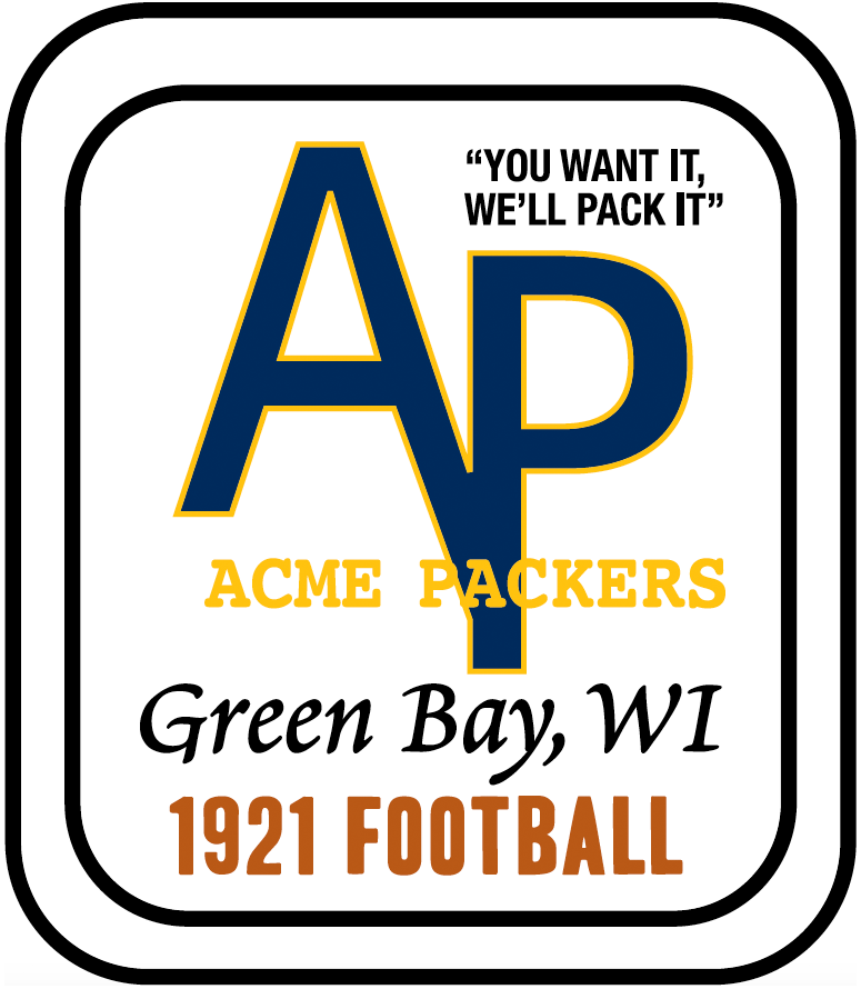
The first logo adopted by the Green Bay Packers had no aspect of sophistication. It consisted, in 1921, of the franchise’s standard names in different fonts on a white background. This first logo dates back to the time when the company’s name was changed to Acme Packing. This change gives the logo the appearance of a Chevron, designed as an oblong angle with rounded edges and bordered by 2 black stripes with a white space in the middle. The letters “A” and “P” of this first logo adopted by the Green Bay Packers crossed in the middle and were the same color. This enabled the franchise to adopt the slogan “You want it, we’ll pack it”.
In 1956, the Green Bay Packers logo took the shape of an orange-yellow football. It features the state of Wisconsin and a quarterback. During the 1956 season, the outfit of the player in the starting position wore the number 41 with the same color as the ball. Wisconsin, on the other hand, wore glass to contrast the character and the object.
![]()
In 1961, the Green Bay Packers adopted the iconic "G" logo and in1980 added a yellow border, which was seen as a kind of encouraging effect. This yellowish line is said to have the power to motivate the team to play well on the field. It represents the struggle for victory, vigor, strength, excellence and perseverance in every encounter.
The different Green Bay Packers outfits and helmets
The Green Bay Packers got off to a tumultuous start when it came to uniforms. This is in stark contrast to the stability seen to date, with a familiar gold and green look. This franchise originally evolved in navy blue (with gold accents on the shoulders) as its main color. This earned them some nicknames: “Bays”, “Blues” or “Big Bay Blues”. The pants popular during this period were worn high, to protect the lower body. The Green Bay Packers also adopted felt uniforms to give players a better grip.
From 1922 to 1924, the Green Bay Packers adopted a new solid gold uniform with nine navy blue stripes on each sleeve. In 1927, the franchise’s jerseys were redesigned to adopt a jockey look. They featured 13 blue and gold vertical stripes, accompanied by faded blue pants. In 1929, the Green Bay Packers adopted a more sober design. This outfit has a dark navy color with small numbers that are surrounded by a circle on the front. These numbers on the front of the jerseys were discontinued between 1931 and 1934.
The current uniforms were adopted shortly after the arrival of Vince Lombardi in 1959. There were, however, a few subtleties between the different jerseys used during this period and today. The helmet shells were gold and have logos. They had a green-white-green stripe at the ends with a green or gold grid. The team wore a green jersey with numbers written in white on the front of the sleeve. This outfit also featured gold and white “Northwestern” stripes, identical to those of the Steelers. The socks used by the Green Bay Packers during this period have a distinctive design. The bottom is gold, with a wide green-white-green lateral stripe.
The Green Bay Packers permanently adopted the uniform look listed in the previous paragraph. A few minor changes have been made. In 1961, franchise officials decided to enhance the “G” logo so that it could represent the silhouette of a football. Further modifications were also made to the stripes on the socks.
To celebrate the League’s 50th anniversary, the Green Bay Packers teamed up with other franchises to put a patch on the left shoulder of their jersey to commemorate the event. In 1975, a slight modification was made to the pants: a wider side stripe was added. At the same time, the Green Bay Packers opted for a green facemask in the same color.
PLEASE SUBSCRIBE TO OUR CHEESEHEAD NATION WEEKLY NEWSLETTER HERE.
__________________________


Comments (4)
stockholder
October 22, 2024 at 05:37 am
The all white look sucks.
(Don't get them Dirty)
If we're No longer America's Team.
This just adds to it.
Decades and decades everyone
loved the colors.
I'm surprised the people who like change.
Don't suggest Florissant colors.
packanimal
October 22, 2024 at 03:17 pm
If the main point of the article is that the team has worn gear with many different color schemes over the past century, then playing one home game in all-white seems like a harmless little novelty. It was just a one-game change of costume and one that, with the "winter warning" idea, played into the long-standing frozen tundra theme. I'm not a huge fan of the all-white look, but it beats the fecal brown pants and helmets of the throwbacks they've worn previously. In any case, fear not, the standard green-and-yellow pattern will return, and order will be restored.
HarryHodag
October 22, 2024 at 06:45 am
I've never liked the "G" logo. I much prefer the logo on Vince Lombardi's practice hat the "GB" intertwined.
MitchAnthony
October 22, 2024 at 01:06 pm
The all white look, especially the white helmets - sucked. Hated it.
The Packers have an iconic look and whether it is a home uniform or away uniform, the helmet is constant to that look. I've heard some people raise the question that Green Bay is two actual words so why only a "G"? Don't care. San Francisco has "SF" right? Don't care. New York Giants have "NY" and the Kansas City Chiefs have "KC" and the Rams have "LA". And I don't care.
That photo of the helmet at the top of this article with the "G" is the one.
Throwbacks, color-rush, monochromatic looks, flavor of the day or month causes are all designed to milk more money from merch sales. Not a fan of that stuff. But if I was to buy a polo or sweatshirt it would have that "G".