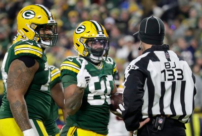
Word on the Street: Packers Going With Nike Pro Combat Uniform Look to Pants
According to Uni-Watch.com, the Packers pants next season could look similar to that of Ohio State's Pro Combat uniform.

Though nothing official has come from the Packers organization, there was mention of the Packers going with a "Pro Combat uniform" look to their pants next season from Uni-Watch.com's Paul Lukas, who writes columns for ESPN.com.
Disturbing note from Jordan Pope, who writes: “I work for a Nike team dealer in Washington and we received our sideline exclusives for Fall 2012 with what appears to be a notable change to the Green Bay Packers pants for next year. The green-white-green striping down the pant leg does not start at the top of the pant but rather farther down, at roughly the same spot as the scarlet stripe in Ohio State’s Pro Combat uniforms.”
Ohio State unveiled their Pro Combat uniforms last week in their win over Wisconsin.
Though Reebok is currently the NFL's official uniform provider, Nike will take over that role beginning in 2012.
With such a tradition-laden team such as the Packers, discussion is sure to center on potential changes the team and Nike might have in store for future seasons given their new-age, cutting-edge looks at not only Ohio State, but notably the University of Oregon, among others.
A history-rich team like the Packers could be resistant to change, but for right now, the changes are focused solely on the pants and not the jerseys or helmet.
Hat tip to the Green Bay Press-Gazette's Jeff Ash on Twitter.
Here's a look at the stripe on the pants from Ohio State's Pro Combat uniform...


Comments (34)
November 03, 2011 at 12:59 pm
As long as they don't change the jersey I'm fine with it
November 03, 2011 at 01:10 pm
If it gets the players excited, I like it. I liked some of the other college uniforms. As long is we aren't replacing anything I like it.
November 03, 2011 at 01:25 pm
Ugh. Hate this.
Mixing a modern, Arena League detail like that with the super traditional uniform the Packers use will look super disjointed.
Waiting for a photoshopped mock-up.
I don't think there's been a uniform change in the last 20 years that was actually an improvement over the old version. And more and more teams are realizing that and going back to their roots - Jets, Giants, Bills, Chargers.
November 03, 2011 at 05:16 pm
Ah, a Creamsicle Bucs fan! I knew there was one out there!
November 03, 2011 at 09:43 pm
Bucco Bruce is da bomb. The new skull on the flag logo is just lame...so generic. They had a classic look going and fouled it up with all the pewter. I liked the stripes on the sleeves and socks.
November 04, 2011 at 10:42 am
Damn right.
Well, maybe not a "fan," but I definitely prefer the Creamsicle to the new unis.
November 03, 2011 at 01:35 pm
I really hope this is not the case. Leave the uniform alone.
November 03, 2011 at 02:09 pm
oh please god, no. i hope this is Nike trying to push their (quite hideous) design agenda on the Packers. I have faith (or lots of hope) that the team knows better.
November 03, 2011 at 09:37 pm
I think the team will know better. They've had so much success with the green and gold Lombardi unis that change is unthinkable. The current look is as big a part of the franchise as Lambeau Field.
MM, TT, and Murphy all respect the traditions and will carry on with the current look.
November 03, 2011 at 02:15 pm
I'm down with a change. Their current uniform leaves much to be desired. As for tradition the Packers wore blue for the first 40 years of their existence. IMO they should go back to a blue and gold look. That would be the real traditional look and the one Lambeau wanted. Something similar to the jersey's they wore the past 2 years as their throwbacks...
November 04, 2011 at 11:58 am
I like that one, as well. If were talking tradition, it's the way to go---minus the brown helmets.
November 03, 2011 at 02:34 pm
I can't stand all this "combat" modern uniform stuff. Do they want the league to look like the Arena league?
November 03, 2011 at 02:35 pm
Pro Combat is the worst thing to ever happen to uniforms, ever. Nike, Adidas and Under Armour have been trying to take away all consistency and tradition from college uniforms over the past few years and replacing them with Frankenstein uniforms that some teams change every few weeks. I do not endorse this change, now get off my lawn Nike.
November 03, 2011 at 03:33 pm
http://bleacherreport.com/articles/525776-2012-nfl-jerseys-by-nike-analy...
November 03, 2011 at 05:24 pm
The Dolphins look is almost migraine-inducing.
FTR, I'm cool with just about anything on a TEMPORARY basis...like 1 game. Beyond that, though, I'll be hard-pressed to endorse any change.
November 03, 2011 at 07:09 pm
These are not Nike's designs. They were released by an independent artist and people assumed they were leaked.
November 03, 2011 at 08:46 pm
One word...Terrible. nuff said.
November 03, 2011 at 04:03 pm
Combat? NFL is a sport...it ain't combat, Nike. Ask a vet.
November 03, 2011 at 04:53 pm
The Oregon uniforms are sick. Nike makes a great uniform I,m interested to see what they can do
November 03, 2011 at 09:10 pm
Woof. I miss oregon's unis from the Joey Harrington days. Nike's designs look like something out of a 14 year old's imagination. Not my cup of tea.
November 04, 2011 at 07:52 am
I like Oregon's uniforms for Oregon. (I also kind of like Maryland's crazy ass uniforms they wore a few weeks back.) But that's college, that's a time for experimenting. Leave the NFL tradition alone.
November 03, 2011 at 09:44 pm
The entie-league uniform switch would be akin to Pepsi removing the color from its soda. I'm not against new things, but I feel like changing *every* team's uniform as a branding/marketing thing would just not go over too well. That being said, a small change - like bring the start of the stripe to the hip instead of the top of the pants - would be okay with me.
November 04, 2011 at 12:43 am
But, Crystal Pepsi was pretty cool for a while back there in '92 and '93.
The uni concepts we've seen here will never be judged as cool.
November 03, 2011 at 11:37 pm
I effing hate this idea. It's not like they are trying to impress 18 year old recruits. Leave this to colleges trying to lure in young adults because they cant pay them.
November 03, 2011 at 11:40 pm
Can I reiterate that the only people who likes these uniforms are still in college?
November 04, 2011 at 02:19 am
So it begins...there are starting to be some really "coincidental" comparisons to the current and future NFL and Arena League Football.
November 04, 2011 at 09:21 am
At least it's the pants. When Nike announced they were taking over the NFL uniforms, they said specifically that some teams "would go farther than others." The Packers won't be one of them. If the only change is the stripe moving down, whatever. Leave the helmets and jerseys alone.
November 04, 2011 at 09:39 am
I hope they stay with Reebok, Nike may be cutting edge for college teams but Green Bay is to rich in tradition to mess with the pants. We have the best looking uniforms in the NFL. I hope this will be reconsidered. Plus I own 3 pairs of pants that I wear on Game Day! Go Pack!
November 04, 2011 at 09:45 am
Let's bring back the gray colored facemasks plz.
And develop a blue and gold contemporary uni for special games...
Tradition and creative leadership do not have to be opposites.
November 04, 2011 at 09:58 am
Does Nike have a design depart to mock these things up or do they just let one of their executives and a monkey throw shit at a wall and see what comes out? I guess it’s hardly a question. I mean, one of the options is ridiculous. Must be latter.
November 04, 2011 at 12:56 pm
I say, go with the 60s era look. Elongate the G on the helmet to more of an ellipse than oval. Bring back the double set of stripes on the sleeves and socks. That is absolutely classic.
November 04, 2011 at 07:06 pm
And the gray facemask. I like the way you think. :)
November 05, 2011 at 04:21 pm
RIGHT RIGHT RIGHT! Looking at those old helmets...or that era paraphenalia... that G can bring out a feeling deeper than words can express..something is there that is not here now.
November 05, 2011 at 05:48 pm
Just found this on the proposed changes to the uni's back in 1993 that Harlam sent to a fan. First, what a class act, BH.
http://farm4.static.flickr.com/3313/3267948469_d9c16d82ce_b.jpg